Make It Games

A Ready-for-Launch Rebrand

The Brief

Make it Games publishes educational card and board games, helping children to learn through play. We were approached to build an engaging identity which appealed to both children and parents alike. The client felt that its current identity was tired and dated and did not reflect the family fun nature of its product range.

The Solution

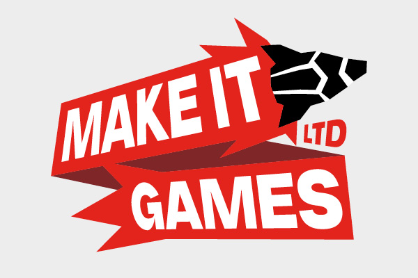
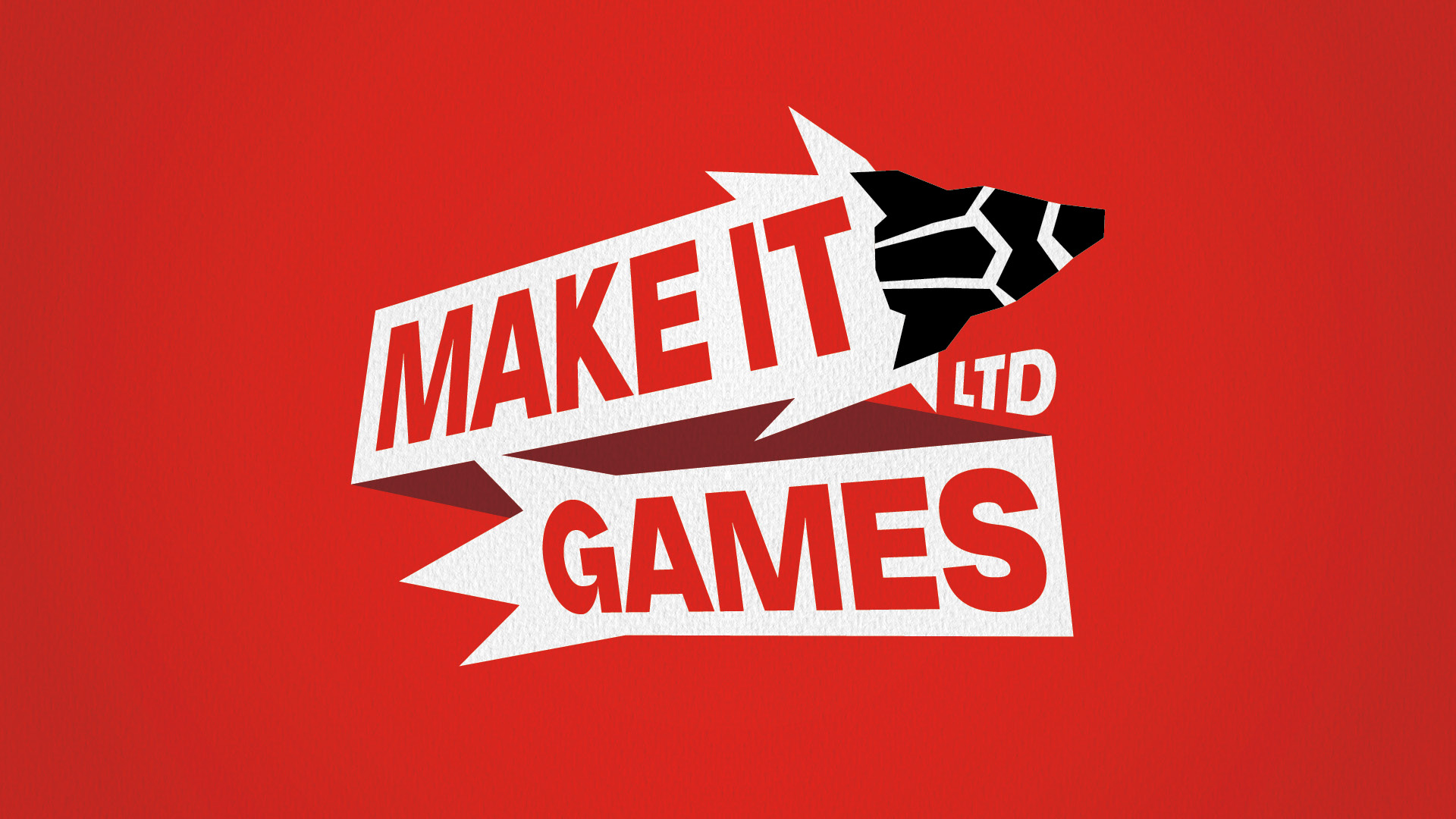
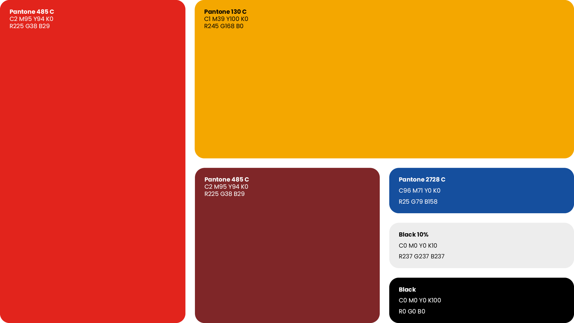
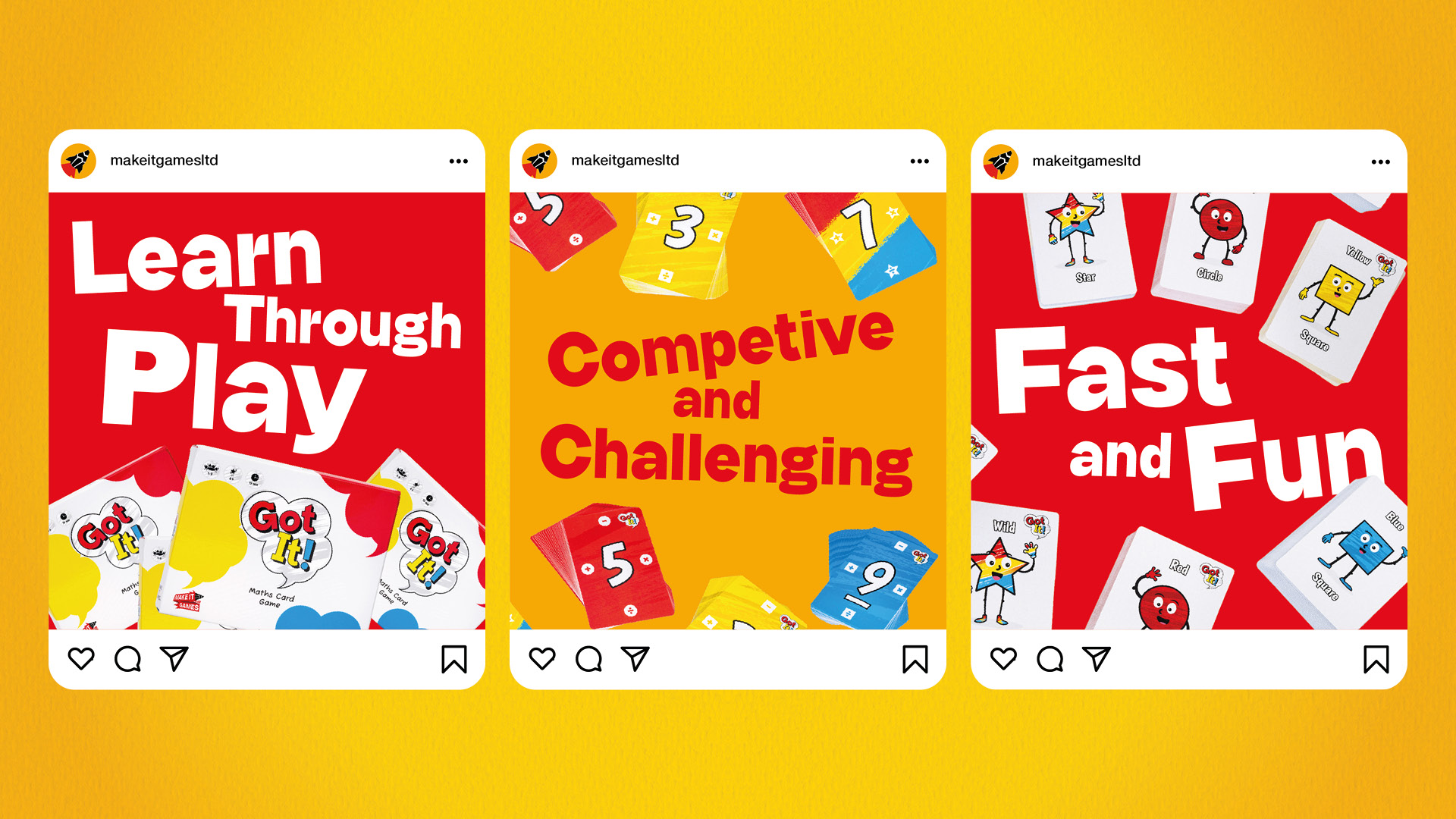
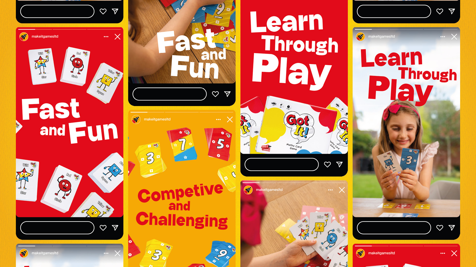
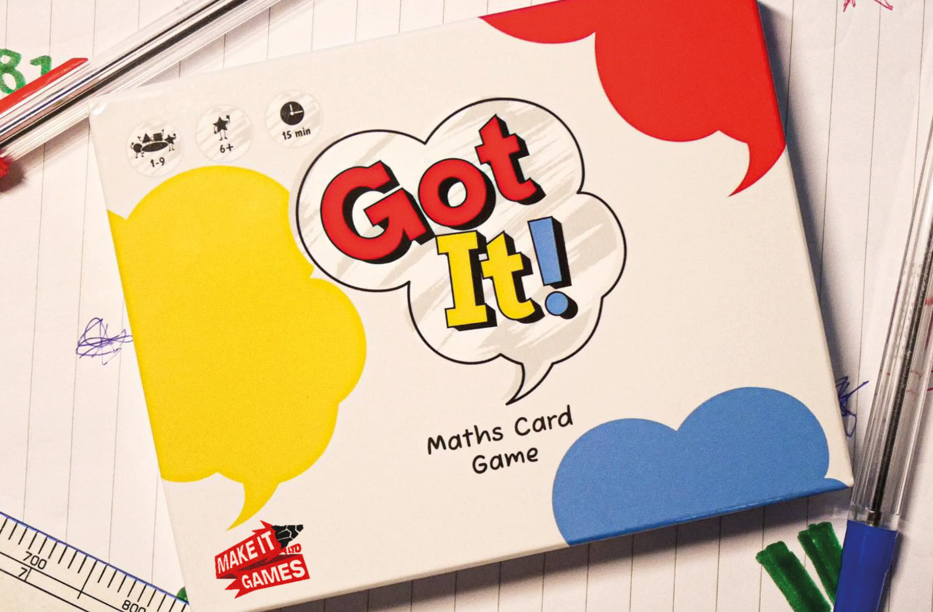
We explored a number of themes, integrating different visual elements of the brand and product offering. The preferred approach combined a rocket to symbolise the fun and excitement of the games, with a pencil to represent their educational value. Jagged shapes, which emulate collaged and cut-out materials, a paper ribbon containing the pencil’s rocket fire and a playful contemporary typeface, were all elements that came together to create an engaging and impactful logomark. The approved concept was further explored across digital and social channels, with product and lifestyle photography combined with different type treatments and a new, bold colour palette.

Previous Logo

New Logo

"After I gave some feedback on the logo I liked the most, The team took everything I asked for and made it 1000X better than I ever thought. The new logo now fits perfectly with the brand values and reflects what the business it trying to achieve."
Will Hanson
Managing Director

Here are some more projects we think you might like