Ducklingo

A Big Brand For Little Readers

The Brief

Ducklingo aims are to teach babies to read from the six-month mark and be fluent readers by age four. Having worked with their parent brand, a private children’s nursery, we were approached to develop a new brand identity to support the launch of their new service.

The Solution

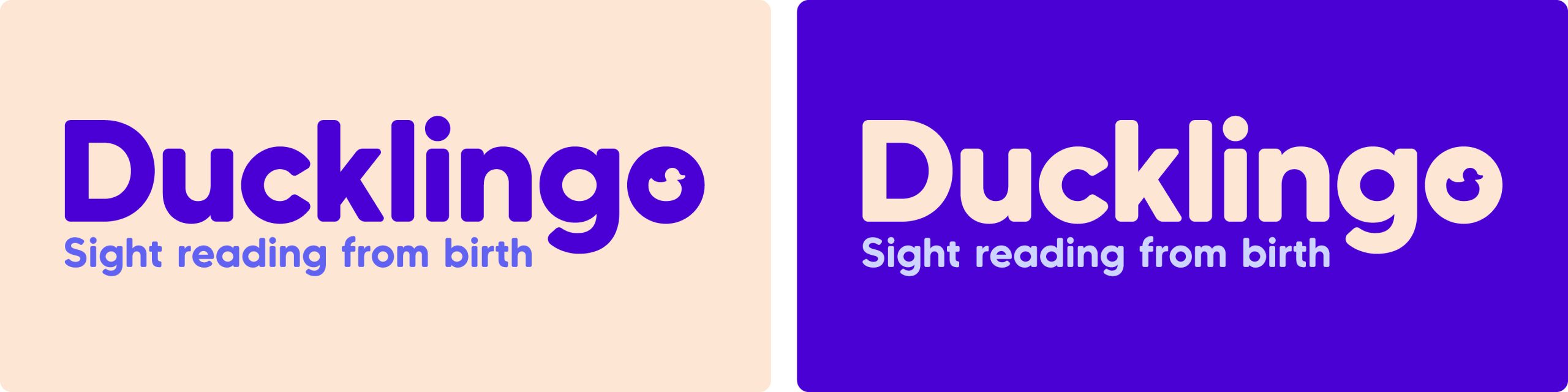
With “reading” front-and-centre, we explored type options where legibility was clear. A soft, rounded typeface was chosen and modified into the new Ducklingo logotype, witht he counter of the O replaced with a new duckling icon. 
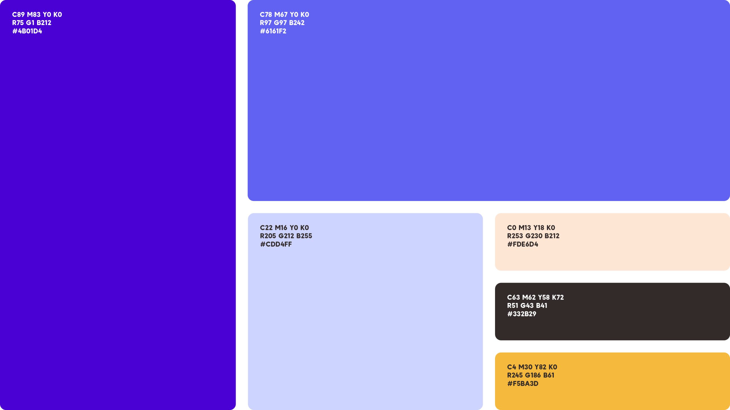
Anchored by the parent brand’s colour palette of cream, brown and yellow. we explored bright and bold colour combinations for this new brand.

Here are some more projects we think you might like